Viral Mutation Analysis
known_mutations Heatmap
A basic but important question: how do we define a lineage? What mutations consistently appear in most sequences within a lineage? We could start by plotting some of the characteristic mutations of XBB occurring in 80% of sequences. Even better, we can do this for mulitple related lineages and compare them using a heatmap:
# Perform authentication if you haven't already
from outbreak_data import authenticate_user
authenticate_user.authenticate_new_user()

# Import outbreak_data package
from outbreak_data import outbreak_data as od


# Collecting 15 characteristic mutations and their prevalences for each variant

lin0 = od.known_mutations("xbb", freq = 0.80)
lin0["lineage"] = "xbb"
lin0 = lin0.iloc[:15]

lin1 = od.known_mutations("xbb.1", freq = 0.80)
lin1["lineage"] = "xbb.1"
lin1 = lin1.iloc[:15]

lin2 = od.known_mutations("xbb.1.5", freq = 0.80)
lin2["lineage"] = "xbb.1.5"
lin2 = lin2.iloc[:15]

lin3 = od.known_mutations("xbb.1.16", freq = 0.80)
lin3["lineage"] = "xbb.1.16"
lin3 = lin3.iloc[:15]

lin4 = od.known_mutations("xbb.1.9", freq = 0.80)
lin4["lineage"] = "xbb.1.9"
lin4 = lin4.iloc[:15]

lin5 = od.known_mutations("xbb.2.3", freq = 0.80)
lin5["lineage"] = "xbb.2.3"
lin5 = lin5.iloc[:15]

# Link each of the findings together for plotting
df = pd.concat([lin0, lin1, lin2, lin3, lin4, lin5])
df["prevalence"] = df["prevalence"].apply(lambda x: x*100)
df= df.rename(columns={'prevalence': 'prevalence %'})

# Plot mutation heatmap
import altair as alt

alt.Chart(df).mark_rect().encode(
    x = "mutation:N",
    y = "lineage:N",
    color = 'prevalence %:Q')
         mutation  mutation_count  lineage_count  lineage   gene ref_aa alt_aa  \
 0      orf6:d61l            4198           4423      xbb   ORF6      D      L
 1         s:l24s            3919           4423      xbb      S      L      S
 2        n:r203k            4378           4423      xbb      N      R      K
 3        s:g339h            4054           4423      xbb      S      G      H
 4        s:v445p            3643           4423      xbb      S      V      P
 ...           ...             ...            ...      ...    ...    ...    ...
 10  orf1a:p3395h            3263           3279  xbb.2.3  ORF1a      P      H
 11       s:n969k            3261           3279  xbb.2.3      S      N      K
 12  orf1a:g1307s            3257           3279  xbb.2.3  ORF1a      G      S
 13       s:d614g            3257           3279  xbb.2.3      S      D      G
 14       s:q954h            3257           3279  xbb.2.3      S      Q      H

     codon_num codon_end          type  prevalence % change_length_nt
 0          61      None  substitution     94.912955             None
 1          24      None  substitution     88.605019             None
 2         203      None  substitution     98.982591             None
 3         339      None  substitution     91.657246             None
 4         445      None  substitution     82.364911             None
 ...        ...       ...           ...           ...              ...
 10       3395      None  substitution     99.512046             None
 11        969      None  substitution     99.451052             None
 12       1307      None  substitution     99.329064             None
 13        614      None  substitution     99.329064             None
 14        954      None  substitution     99.329064             None
[90 rows x 12 columns]

Comparing Lineages
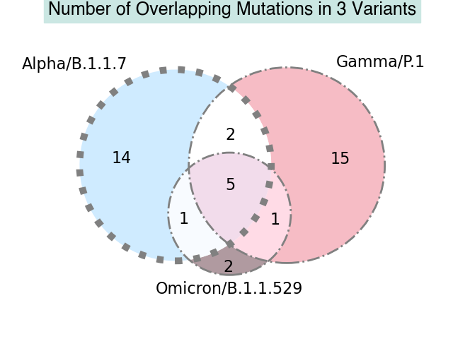
To better understand the evolution of SARS-CoV-2, we may also want to know what mutations are shared between different viral lineages and how many shared mutations there are.
For this example we'll look at three different lineages: B.1.1.7, P.1, and B.1.1.529. First, let's get an idea of which mutations are shared between all three lineages:
lin1 = od.known_mutations("b.1.1.7")
lin1["lineage"] = "b.1.1.7"

lin2 = od.known_mutations("P.1")
lin2["lineage"] = "P.1"

lin3 = od.known_mutations("b.1.1.529")
lin3["lineage"] = "b.1.1.529"

#Finding intersections

#Created an optional but convenient intersecting function
def intersect(lst1, lst2):
    return set(lst1).intersection(lst2)

a = set(lin1['mutation'])
b = set(lin2['mutation'])
c = set(lin3['mutation'])

m12 = intersect(a, b)
m13 = intersect(a, c)
m23 = intersect(b, c)
m123 = intersect(m12, c)

print('Set 1.2:', m12)
print('Set 1.3:', m13)
print('Set 2.3:' , m23)
print('Set 1.2.3:', m123)
 Set 1.2: {'orf1b:p314l', 'orf8:s84l', 'orf1a:del3675/3677', 'n:r203k', 's:d614g', 's:n501y', 'n:g204r'}
 Set 1.3: {'s:p681h', 'orf1b:p314l', 'orf8:s84l', 'n:r203k', 's:d614g', 'n:g204r'}
 Set 2.3: {'orf1b:p314l', 's:h655y', 'orf8:s84l', 'n:r203k', 's:d614g', 'n:g204r'}
 Set 1.2.3: {'orf1b:p314l', 'orf8:s84l', 'n:r203k', 's:d614g', 'n:g204r'}
Finally, we can make a visual based on our findings and create a Venn diagram of our results:
# Import libraries for venn diagram visual
from matplotlib_venn import venn3, venn3_circles
from matplotlib import pyplot as plt

# Using matplotlib_venn to make venn diagram with custom visuals
 ## The venn diagram package used here automatically determines the number
 ## of intersecting values and plots accordingly

vd3 = venn3([a, b, c], set_labels = ('Alpha/B.1.1.7', 'Gamma/P.1', 'Omicron/B.1.1.529'), set_colors=('#c4e6ff', '#F4ACB7','#9D8189'),
 alpha = 0.8)
c = venn3_circles([a, b, c,], linestyle = '-.', linewidth=2, color='grey')
for text in vd3.set_labels:
 text.set_fontsize(16);
for text in vd3.subset_labels:
 text.set_fontsize(16)
plt.title('Number of Overlapping Mutations in 3 Variants',fontname ='Helvetica',fontweight ='bold',fontsize = 18,
 pad = 30,backgroundcolor ='#cbe7e3',color ='black', style ='normal');
c[0].set_lw(7.0)
c[0].set_ls(':')
plt.show()

We can see that the graph matches the number of intersecting mutations that we previously saw, given that the venn diagram also takes into account unique values for each set.
Note
Please see the matplotlib venn diagram documentation and this article for more info on how to create these graphs.