Lineage Prevalence Analysis
The outbreak_data package has contains multiple endpoints that can collect information on SARS-CoV-2 lineages. Pulling data from a combination of endpoints will allow you to conduct your own analysis on the progression of SARS-CoV-2. On this page, you’ll find a few example workflows that demonstrate how to collect, manipulate, and visualize prevalence data in SARS-CoV-2 lineages.
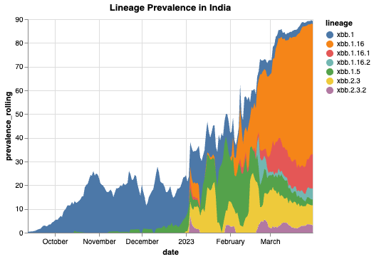
Here is how we would go about collecting data to find all the XBB lineages prevalent in India within a 1-year timeframe:
# Perform authentication if you haven't already
from outbreak_data import authenticate_user
authenticate_user.authenticate_new_user()

# Import outbreak_data package
from outbreak_data import outbreak_data as od

# Get the prevalence of all circulating XBB lineages in India
data = od.prevalence_by_location("IND", startswith = 'xbb')
# multiply prevalence values by 100% for scale
data['prevalence_rolling'] = data['prevalence_rolling'].apply(lambda x: x*100)
# Search for data based on date range
data = data.sort_values(by="date")
data = data.loc[data["date"].between("2020-09-12", "2022-03-31")]

## Use the visual package of your choice to create an area graph using your data
import altair as alt

# Graph of results
alt.Chart(data, title = "Lineage Prevalence in India").mark_area().encode(
x='date:T',
y=alt.Y('prevalence_rolling:Q'),
color = 'lineage:N')
            date  total_count  lineage_count     lineage  prevalence  \
 3014 2022-09-12            0              0    xbb.1.16    0.000000
 3781 2022-09-12            0              0     xbb.2.3    0.000000
 2593 2022-09-12          152              2       xbb.1    0.013158
 3782 2022-09-13            0              0     xbb.2.3    0.000000
 3015 2022-09-13            0              0    xbb.1.16    0.000000
 ...         ...          ...            ...         ...         ...
 4086 2023-03-31          196              2   xbb.2.3.2    0.010204
 3322 2023-03-31          196             29  xbb.1.16.1    0.147959
 2793 2023-03-31          196              1       xbb.1    0.005102
 3381 2023-03-31          196              7  xbb.1.16.2    0.035714
 3981 2023-03-31          196             15     xbb.2.3    0.076531

      prevalence_rolling
 3014            0.000000
 3781            0.000000
 2593            0.003451
 3782            0.000000
 3015            0.000000
 ...                  ...
 4086            0.031184
 3322            0.144578
 2793            0.014174
 3381            0.045358
 3981            0.084337
[985 rows x 6 columns]

Note
The Vega-Altair visualization package is used for demonstration purposes. However, any Python visual package can be used to create graphical representations of the data.
Finding the Most Prevalent Lineages
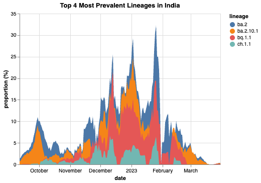
If we wanted to determine and plot the top four most prevalent lineages in India, we can make a few queries and use a few simple commands to create a table that shows us what these lineages are:
data=od.prevalence_by_location("IND")
most_prev = data.groupby('lineage').apply(max) # Finds the lineages with the most hits
most_prev = most_prev.mask(most_prev == '').dropna(how = 'any') # Drop any unknowns
most_prev = most_prev.iloc[:4]
print(most_prev)
                  date  total_count  lineage_count    lineage  prevalence  \
 lineage
 ba.2       2023-04-20         5668           1445       ba.2    0.822785
 ba.2.10.1  2023-04-19         5668             93  ba.2.10.1    0.285714
 bq.1.1     2023-03-27          402              7     bq.1.1    0.428571
 ch.1.1     2023-02-13          119              4     ch.1.1    0.400000

            prevalence_rolling
 lineage
 ba.2                 0.677541
 ba.2.10.1            0.095541
 bq.1.1               0.156863
 ch.1.1               0.066667
Next we’ll collect the prevalence data on each of the four lineages:
# Retrieve the official data on the prevalences of these lineages using `daily_prev()`
d1 = od.daily_prev('ba.2', "IND")
d2 = od.daily_prev('ba.2.10.1', "IND")
d3 = od.daily_prev('bq.1.1', "IND")
d4 = od.daily_prev( 'ch.1.1', "IND")

# Formatting for creating the graph
d1['lineage'] = 'ba.2'
d2['lineage'] = 'ba.2.10.1'
d3['lineage'] = 'bq.1.1'
d4['lineage'] = 'ch.1.1'

# Group together data from each lineage
data = pd.concat([d1, d2, d3, d4])
data = data.rename(columns = {'proportion': 'proportion (%)'})

#Pick a date range to analyze
data = data.sort_values(by="date")
data = data.loc[data["date"].between("2022-09-12", "2023-03-31")]
# Increase prevalence by 100%
data['proportion'] = data['proportion'].apply(lambda x: x*100)

#Graph using preferred visual package
import altair as alt
alt.Chart(data, title = "Top 4 Most Prevalent Lineages in India").mark_area().encode(
x='date:T',
y=alt.Y('proportion (%):Q'),
color = 'lineage:N')
